ShopDreamUp AI ArtDreamUp

Deviation Actions
Daily Deviation
Daily Deviation
February 10, 2011
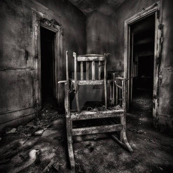
Behind the Mirrors by ~unkreatives is a "wonderful picture", but beyond that it's a great example of playing around with the art for of photography - a 90-image panoramic HDR.
Featured by isthisthingstillon
Suggested by OliviaMichalski


Description
Hohenlychen 2009,
abandoned hospital complex near Berlin
trip with and
and 
Olympus E-520
Pano-HDR out of 90 shots
abandoned hospital complex near Berlin
trip with
and Olympus E-520
Pano-HDR out of 90 shots
Image size
3543x3543px 10.47 MB
Comments301
Join the community to add your comment. Already a deviant? Log In
Personal style is important and helps a lot to represent the artist. unkreatives seems to like heavily edited hdr-photos as his gallery is full of them. That's his personal style and therefore I'm not going to write this critique against him. This critique is about the image itself (not about the artist behind it, so it's not supposed to attack anybody) and it is representing my very own personal opinion and impression.
Square is the new black. That might work for a lot of people out there. It IS working if the content and scene are adequate. In this case the dimension of the stairway got lost. It looks very squashed and more like it was a 2:3 vertical pic before. Hand in hand with that issue is the distortion going (visible at the window). The question is: by editing the image that much, why isn't it possible to correct the distortion as well?
The colors are completely fake and wrong. To get an impression of how it looked like in reality, have a look at this photo [link]
Basically the hdr is destroying the scene, which itself is quite nice. It's either representing the architecture there nor the spirit that is behind the whole sanatory of Hohenlychen.
Why am I able to say that? I was there myself twice and it's a shame that such beautiful old buildings are tried to be put into something completely different by editing them that much.
All in all this image is in the wrong category as (from my point of view) it doesn't have anything to do with photography but with editing. The artist said himself in the comments that you can use white lines and radial blur to simulate sunshine.
I'm really sorry for the harsh critique. If uploaded to photomanipulation gallery, my critique would have looked completely different as we were talking about another attempt of art then.
Maybe you got my point unkreatives or you didn't get it. For some scenes in your gallery, the hdr is working. For this one, it's not.